Showing posts with label display. Show all posts

Tuesday, June 23, 2009

More from Phoenix Bride & Groom...

I was positively giddy when I got the mail today because in addition to bills and miscellaneous catalogs, I received a disc of images from the "Tickled Pink" spread that you can see in the new issue of Phoenix Bride & Groom Magazine.

Ben Quillinan, photographer genius from BQ Photography, was kind enough to share the images from this amazing shoot. I am still in complete awe of the way it all came together. What started as a "pink, black and white table" soon morphed into this insane fabulousness:
It's so exciting to participate in something so gorgeous! Thank you so much, Ben, for sharing these incredible images!
Credit belongs to the following fabulous vendors:
Photography: BQ Photography
Floral and Set Design: Angelic Grove
Paper Products: yours truly
Videography: My Wedding Film
Photo Shoot Coordinator: Victoria Canada Weddings & Events

Wednesday, June 17, 2009

Happy Anniversary, Phoenix Bride & Groom!

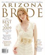
The new issue of Phoenix Bride & Groom Magazine is out, and they really went all out for their big 10th Anniversary issue! 
Check out the amazing cover photo, shot by the amazingly talented duo at Sedona Bride:
Kelly Ashworth Design was featured for a section devoted to all things papery, as well as an amazing on-site photo shoot orchestrated by the amazing Victoria Canada of Victoria Canada Weddings & Events. Here's a sneak peek of the invites, image courtesy of Eyes 2 See Photography (Stuart, you rock!)
I love this paper, with its mod quatrefoil pattern on the most perfect shade of green. I was so excited I had the opportunity to share it with the world! (Or at least the greater Phoenix bridal market).
To get more info on the magazine, check out the Phoenix Bride & Groom website. Congrats on 10 amazing years, ladies!

Tuesday, April 14, 2009

The Birds & The Bees Baby Shower

I recently had the opportunity to design another display table at Bright Event Gallery, which is always an exciting endeavor. I am endlessly grateful to the Bright Girls for allowing me to bring my tablescape dreams to life.
With the assistance of some other fab Bright vendors, we created a baby shower vignette that revolved around 'The Birds and the Bees'. Vibrant citrus colors, a combination of modern and traditional elements and lots of economical choices helped to make this design a success.
Take a look:
Love the gorgeous shimmery linen from Tri Rentals' specialty line. It's even prettier up close. And check out the hot green dress and suit in the background. The dress is from Twirl (are you reading their blog? Loads of great tips, ladies. I'm going to hire Keri as my own personal Spanx shopper) and the suit is courtesy of Mr. Formal. This is the beauty of a Bright Event Gallery display table - not only will they show you great ideas for table dressing, they'll also provide some stellar ideas on how to dress yourself!
Notice the fun citrus-y hanging lanterns? Walmart, people! Cheap chic. They look fantastic hanging from the ceiling or they'd be great bunched together on a buffet table.
Carnations are back! Not only are they incredibly affordable, look how cool they look in monochromatic bunches. The Flower Studio designed these gorgeous groupings with just the right dose of green grass. 
I found this fabulous paisley scrapbook paper at Michael's and created a mat for the table name. Then popped it all in this IKEA frame
Favor bags hung from the back of each chair. 
I still can't get over these cupcakes from Julia Baker Confections. Amazingly cute, not to mention scrumptious. If you're throwing a shower and want to save $$ on favors, just serve these cupcakes for dessert. Your guests will swoon, guaranteed.
Menu cards designed and assembled by yours truly. 
Cute porcelain bird salt and pepper shakers from Pier 1 add a fun sculptural element and reinforces the theme without hitting you over the head.
Another great Pier 1 find, and on clearance no less! These dainty glasses complemented some of the more modern elements on the table. And who doesn't love a fancy straw?
To complete the look, I took the leftover scrapbook paper and created some belly bands for the napkins that doubled as place cards. 
Special thanks to Jennifer Bowen for these fantastic photos. Have you seen her work? She's AMAZING! I was lucky enough to have her contribute some baby images for my new line of Birth Announcements. She rocks. Call her. 

Monday, November 3, 2008

Getting Political

The Bright Girls came up with a clever idea for the October Display table at their lovely event gallery. In lieu of anything involving ghosts and goblins, they went for another theme sure to horrify many -- the 2008 Election.

I will admit, this was one of the most challenging table displays I've worked on yet. Not because the style was unusual or the technical aspects were particularly difficult. The true challenge was to provide a design that highlighted each candidate equally without infusing a lot of personal bias. You can make fun of each candidate and their respective running mates in a variety of different ways, but in doing so you risk alienating the other 50%.
So I tried to focus on the black and white of the parties. I incorporated donkeys and elephants where I could. I created "red state" and "blue state" place cards. And the menus mimicked a ballot, but instead of choosing a candidate based on his credentials, you got to choose based on his favorite meal. (Thanks to the Wall Street Journal for caring enough to dig up the candidates favorite restaurants!)
{ Neckties adorned the chivari chairs -- an idea inspired by Cicely! }
{ The country is divided. The tables are divided. }
{ With apologies to Ralph Nader and Cynthia McKinney. Donkeys and Elephants only. }
{ Place setting detail -- Barack Obama's seat complete with an "I heart Blue States" place card. }
{ McCain cookies from Tammie Coe. She has Obama, too. }
Special thanks to Keith Pitts for the images!

Monday, September 29, 2008

Nerd Alert!

A few months ago, I was chatting with Kelly over at Bright and casually mentioned that I had some ideas for a new display table at the aforementioned event gallery. I was ecstatic with the level of enthusiasm this was met with, and even happier when the girls let me see out my idea in the form of the August display table.

My concept was born out of a desire to see something that is not traditionally associated with style and turn it into something cool. The "something" in this case was science, particularly Chemistry.
I recall many a late night sitting at the kitchen table with my dad as he patiently explained (for the bazillionth time) how to write out and balance chemical equations. I never considered my Chemistry classes to be anything but horrible graduation requirements. I'm still not the first person you'd want to ask about atomic weights or inorganic compounds, but I do look back now and appreciate the struggles because I know in the long run it made me a better student. And it made my dad one helluva teacher. 
So here it is, my stylish tribute to science. Or as I like to call it, Geek Chic.
No science-inspired table display would be complete without the periodic table of elements. 
I found some great visuals online and recreated the chart on metallic paper with black and green ink. The name itself is a play on words. Please be seated at The Periodic Table. I can just see my high school chem teacher's eyes light up.
 
The look of the table revolved around a palate of greens, black and white with lots of clear glass. The centerpiece candlesticks (used as vases above) came from CB2. You can get your own right here. Erlenmeyer flasks filled with green candies served as a cool favor. These are also a fantastic alternative to a traditional vase. 
 
I dug out one of my favorite Einstein quotes, printed it on sheer vellum and laid it over a cool graphic patterned paper for the menus. It reads: "gravitation cannot be held responsible for people falling in love." The plates came from Tri Rentals. I kind of want them for myself.
Special thanks to Harrison Hurwitz for these lovely images, and to the Bright girls for allowing me to bring this idea to life. 

Wednesday, March 12, 2008

Fierce Toile

OK, I could have titled this post "Tranny Toile" for some ferosh alliteration but figured that might be a tad much. Still- can't you just see Christian checking out this display table and exclaiming, "FIERCE!" Well, maybe that's a stretch, but I just had to work in a "fierce" while it's still relevant. 
Anywho...the Bright girls wanted an Easter Brunch table. They said, "Yellow and blue toile. Make it work." (OK, no more references to PR, I promise.) 
So I used some cool yellow/metallic/embossed paper with navy linen stock, threw in a rooster motif and some navy gingham ribbon and was ready to rock. 
Co-contributors to this fierce hot mess:
Floral – TableTops, Etc.
Linens – Cloth Connection
Rentals – Tri Rentals
Photographer – Keith Pitts
And special thanks to Liene for posting the Christian SNL skit on her blog :)

Monday, February 11, 2008

80's Glam

I have to admit, I am not a big fan of the 80's. I was never crazy about the music or the lace gloves (although jelly shoes and bracelets do give me a warm fuzzy). So when the Bright girls asked me to do paper products for an 80's table, I was a bit skeptical. But Bright's newest addition, Katie (who is adorable) had a wonderful 80's vision that included polka dots, gerber daisies and pops of pink.
The Flower Studio provided the giant gerber daisies, and the Bright girls wrapped the vase in patent leather belts. I made paper products out of glossy black paper, that actually looks like patent leather, so it looked very put together. Victoria requested place cards that could somehow incorporate a flower, so I made tented "vases" (just a hole punched at the top to accommodate a single stem). Table numbers were tin cans wrapped in patent paper that can also be used as a mini vase for extra floral or a candle.
I also love that the girls set out Tab cola to coordinate with the table. Very Marty McFly...maybe I like the 80's more than I think.
Mark Cafiero shot these great photos.

Tuesday, October 23, 2007

Fall into Bright

The girls over at Bright asked me to come up with some new paper products for their "new take on fall" table. Ok, I don't know what the theme was here, I just made that last part up. But I'm always excited to work with them because the focus is always on the original. No restrictions or rules, which is every designer's fantasy. 
In any event, look at the gorgeous floral and linens! The Flower Studio has once again outdone themselves -- brides, call Robin and Christine today. Their studio is gorgeous and their portfolio of work is simply amazing...
I had an idea in my head that I wanted to produce for awhile and this tablescape gave me the perfect opportunity. In my never-ending quest to "combine and design", (Ok, that was super cheesy) I present the program/menu/thank you/favor. In short, you create one booklet with all of these elements and use them to dress up your tables. 
You will also see some patterned place cards and a table number made out of coordinating patterned paper. 
Thanks to the always amazing Hollye Schumacher for these photos! 

Friday, August 3, 2007

Tablescapes

I recently participated in the 1st annual NACE Events Elements Competition for tabletop design with the girls from Bright Event Gallery. Our themes were "Fire" and "Earth" and we placed 3rd for our Earth table. Saa-weeeeet! For the Earth table, we used newspaper to create menu pockets, and river rocks for place cards. Victoria even fashioned some centerpieces out of newspaper. There were also bamboo chairs, burlap favor bags and recycled 3-D table numbers. For the Fire table, we went with a "where there's smoke, there's fire" theme. Lots of shades of gray -- and check out those chargers! Have you ever seen so much bling? The menus were done on translucent vellum, and we did tiny place cards that came with a magnifying glass. Because magnifying glass + sun = fire and smoke. Thanks to Kelly & Victoria over at Bright for sharing the photos and inviting me to take part in this!

Wednesday, May 30, 2007

Bright Table for Bright Events

I was asked to create paper products for the latest table display over at Bright Event Gallery in Old Town Scottsdale. If you haven't been to Bright yet, you must go. If you've already been, go back. Now. The girls always have something new and exciting displayed and it's a great place to plan your next event or shop for cool handbags, t-shirts and other fun stuff. I worked with a citrus-y color palate and created menus on skewers for a more casual vibe. I also created a combination place card/favor for each of the guests. I love doing this as it saves room on your tables and your guests are guaranteed to take their favors. In honor of my current TV obsession ("The Office"), I created the place cards for Jim, Pam, Dwight and Angela. (Wouldn't this be a hilarious double date? That's my suggestion for a new episode.) I also designed some bachelorette t-shirts for the retail side of the gallery. Act now, supplies are limited! Thanks to Melissa Jill for the photos!